Redesign BobaTalks Scheduling Experience

BobaTalks is a nonprofit helping students navigate career development through coffee-chat mentorship. This project aims to improve the previously non-digital scheduling experience for mentors and mentees.
Timeline
May 2024 - Sep 2024
Contributions
Research (30%)
Interaction Design (50%)
Visual Design (40%)
Design System (80%)
Team
1 PM
1 Design Manager
2 UX Designers
4 Developers
Client Leadership Team
Result
Delivered for Implementation
SOLUTION HIGHLIGHTS
Help mentees easily find the right fit mentor and book a time
Help mentors effortlessly manage sessions and availabilities
The Old design
The scheduling flow was inefficient and frustrating
To begin with, I looked at the old design and analyzed the core flow of scheduling, and identified a lot of issues—mentors were listed without any filters, and many booking links were expired, so mentees often cannot find available time slots. Also, users had to switch between Discord, LinkedIn, and BobaTalks' website to manage communication and scheduling.
User Research
To understand pain points, we conducted interviews and surveys with mentors and mentees
😰 📅
Redundant process
The entire process is so redundant that it creates friction for users
😞 🔍
Poor matching
The mentor-mentee matching process is inefficient, requiring a lot of back-and-forth
Design Goals
Here are our design goals:
😊 📅
Digitize and streamline scheduling
😄 🔍
Improve mentor discovery
user flow
Before vs after
The old scheduling process was redundant and required a lot of manual and offline work for both mentors and mentees, with BobaTalk staff involved. In the new design, I streamlined the manual workflow.

DESIGN CHALLENGES
While many features are involved, this case study will focus on two design challenges:
🔍
Help mentees to find a suitable mentor efficiently
📅
Help part-time mentors better manage their mentorship schedules
Design Challenge 1
Help mentees to find a suitable mentor efficiently
COMPETITIVE ANALYSIS
Research competitors' search and filter designs across mentorship, travel, and e-commerce to summarize key patterns

Place the most important categories prominently

Collapse secondary filters
Grid view
List view


Grid view for image-based content, list view for text display
layout design

Grid view
Images are too prominent and not helpful for decision making
List view
More readable
Make better use of space
Use vertical filter to reduce manual effort and better use space

Horizontal filter
Filters need to be expanded to see what's included
Vertical filter
More efficient, not need to expand filters
Make better use of space
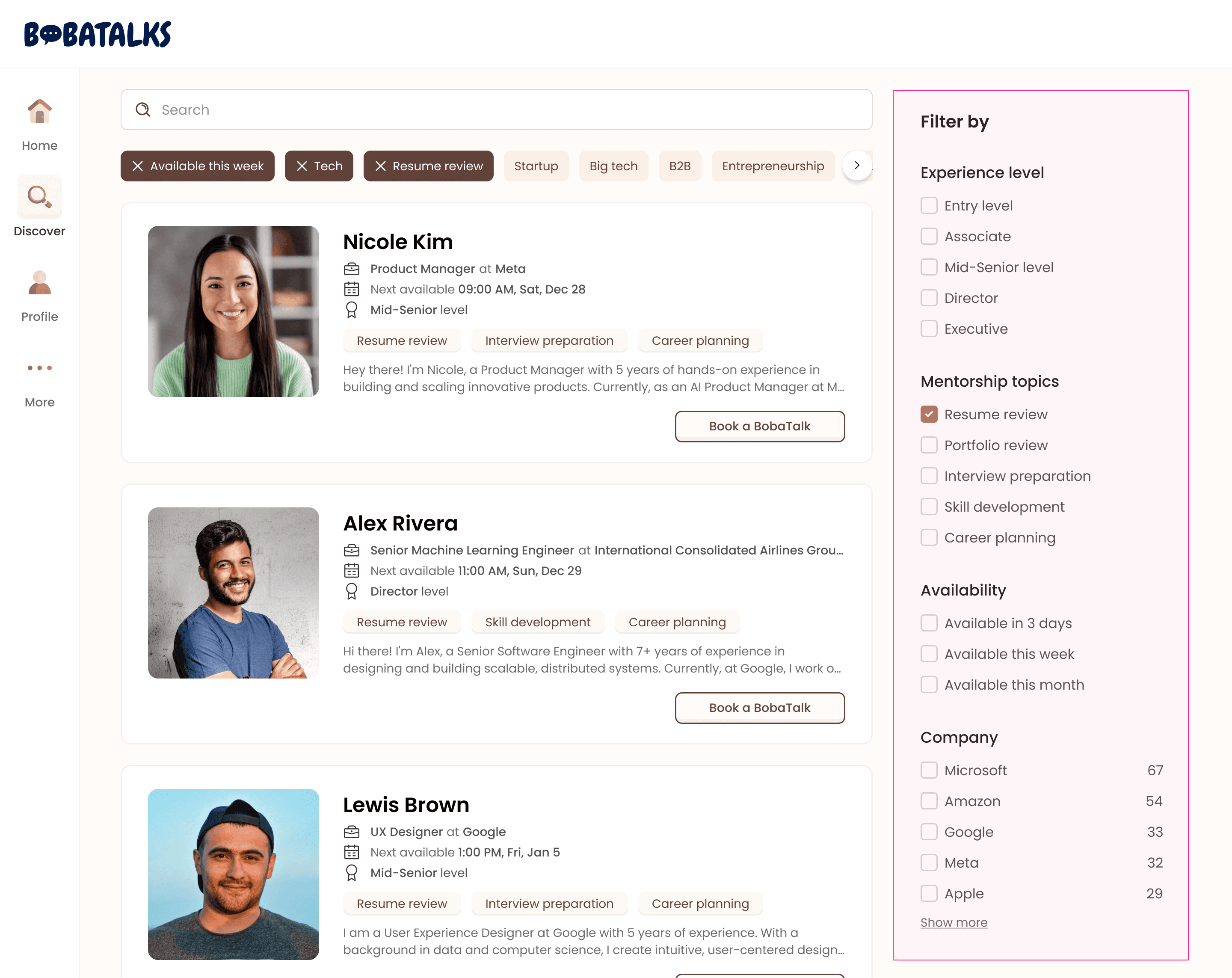
FILTER DESIGN
Use survey to rank filter criteria

Separate the role filter since users rarely change it
Users usually begin scoping with the most fundamental criterion: the role, which is rarely changed. So, I separated it from the other filters under the search bar.

Rank other filters based on survey results

Place popular keywords under the search bar for easier access
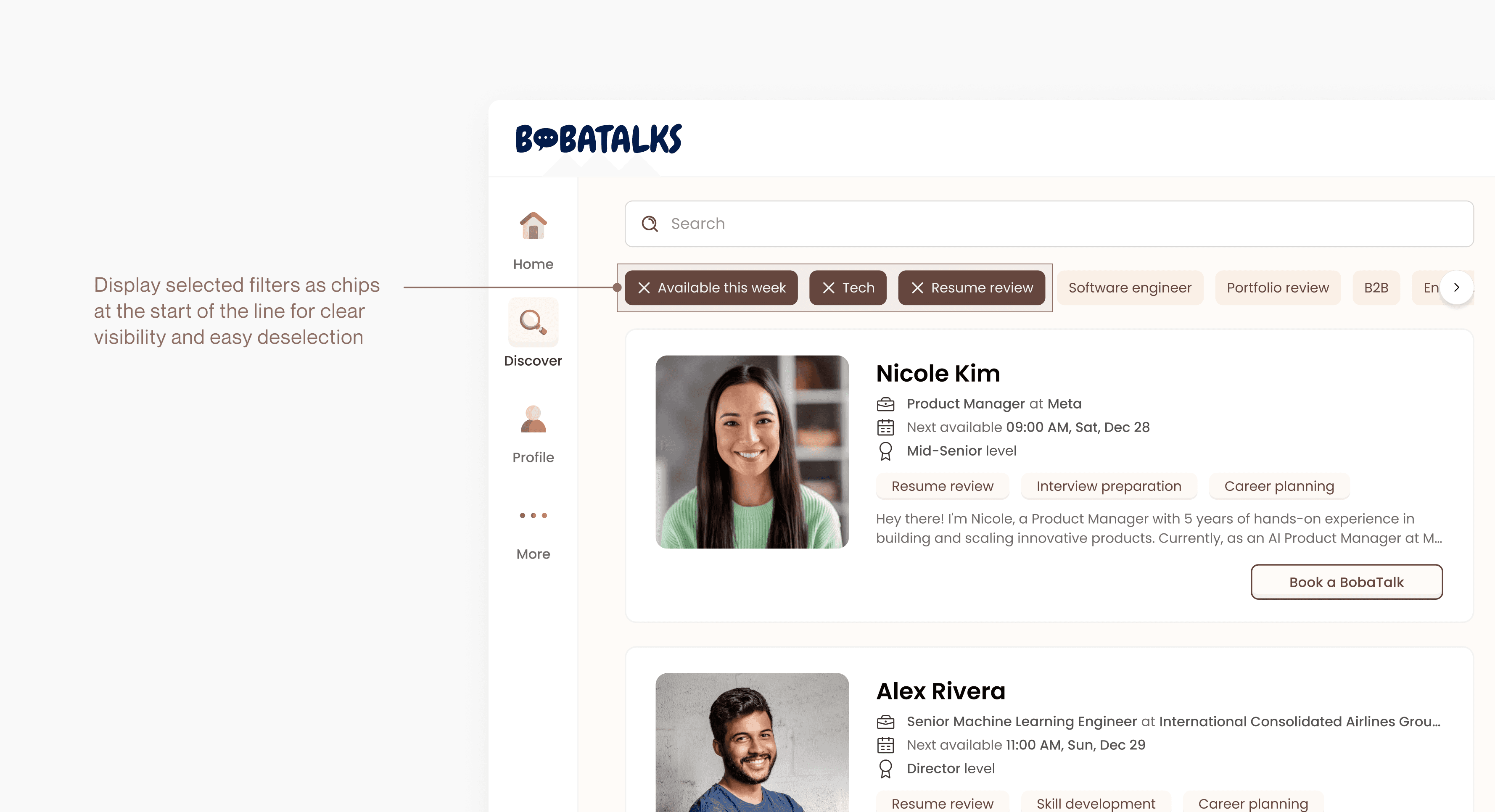
Status: filters selected
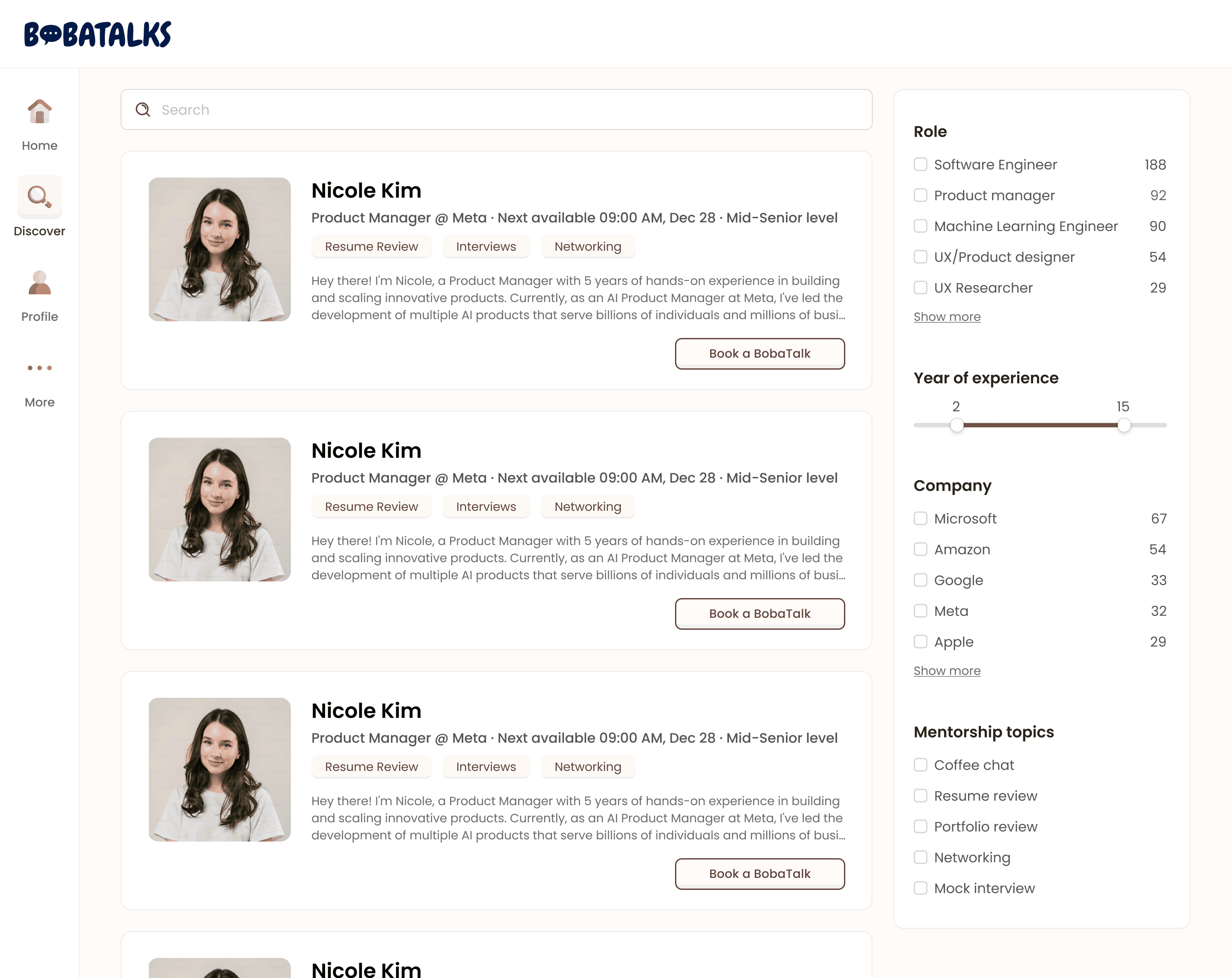
mentor CARD DESIGN
Keep iterating on the mentor card to explore visuals and account for edge cases

V1
CTA button is too prominent

V2
Role, YOE, and level may have long text, making readability and scalability poor

Final design
Long text scenarios considered
Small icons help quickly identify different types of information, enhancing readability
FINAL DESIGN
Design Challenge 2
Help part-time mentors better manage their mentorship schedules
CURRENT DESIGN
Mentors reply on external tools like Calendly, but they don't meet part-time mentors' flexible needs
These external tools are commonly used for team check-ins, one-on-ones, and project updates. In these contexts, they primarily help streamline recurring meetings.

PAIN POINTS
However, BobaTalks' mentors are part-time volunteers usually without fixed schedule on mentorship, leading to two problems:
Schedule changes often
Mentors' varying schedules make recurring sessions impractical. Flexible scheduling allows weekly bookings as needed.

Difficult to manage multiple calendars
Mentors often juggle personal and company calendars, making it difficult to switch back and forth to find available time.
KEY FEATURES
We designed two key features to address the problems:
"Does not repeat" schedule pattern
Mentors can set up individual availability slots without committing to a repeating schedule
External calendar connect & overlay
Display events from connected calendars alongside mentorship sessions, helping mentors avoid conflicts
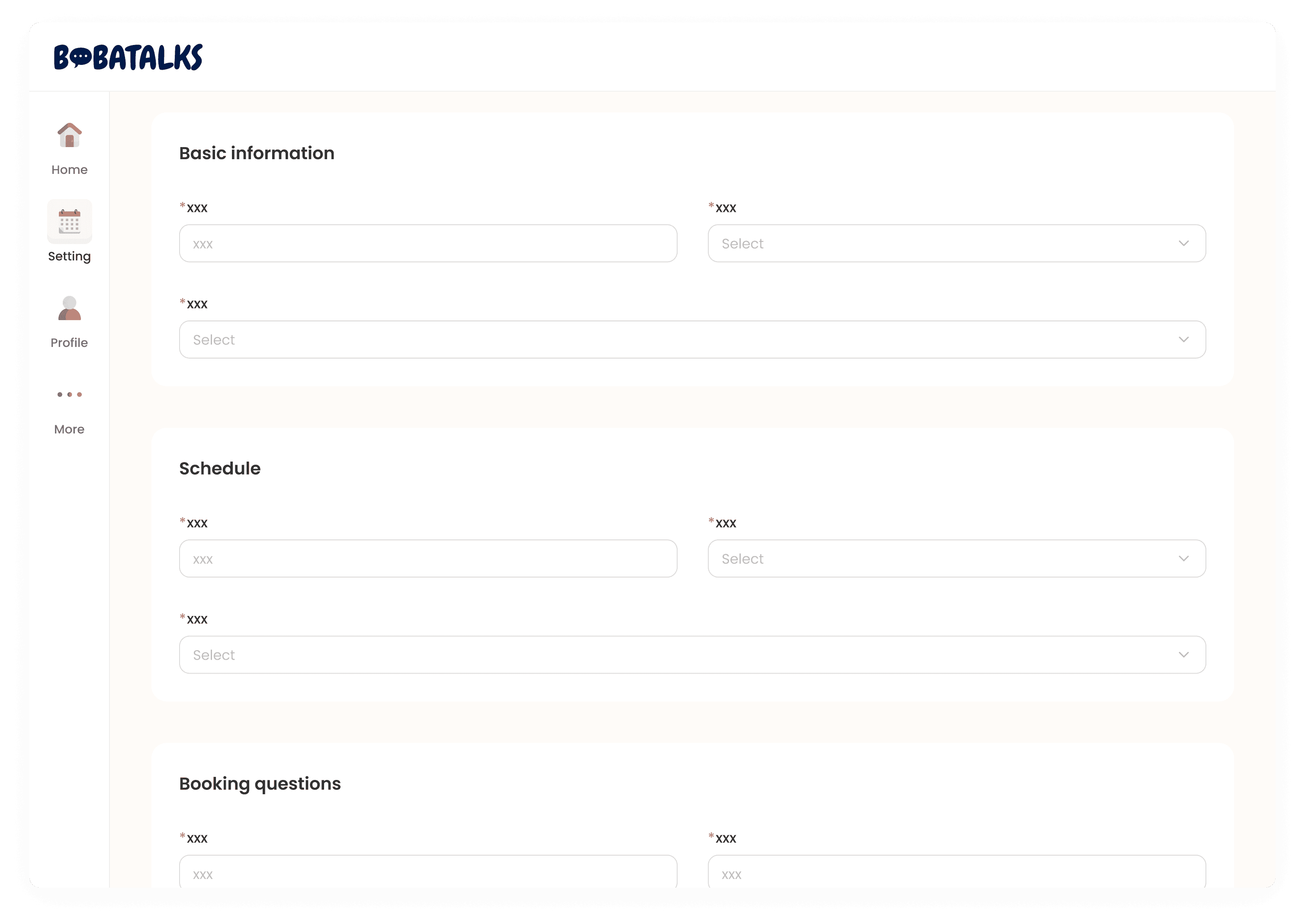
LAYOUT EXPLORATION
I defined the scheduler with four sections based on competitive analysis and mentor needs
I researched relevant products, summarizing UX patterns and design practices. By combining these insights with findings from previous research, I integrated mentors' specific needs—such as using booking questions to learn about mentees and align expectations.

Basic information

Schedule

Booking questions

Calendar
Explored layouts to optimize space and improve navigation
Sections
Hard to nagivate

Tabs
Easier to navigate
Lack of space to clarify each section's meaning
Sidebar menu
Sufficient space to clarify each section's meaning
Easy to navigate to specific section
KEY DESIGN DECISIONS
Connect external calendar to coordinate multiple schedules

Different repeating modes accommodate both recurring and ad hoc schedules

FINAL DESIGN
What's more
How might we connect the marketing page with the dashboard?
After finalizing the dashboard design, we planned to integrate it with the marketing page. Initially, I thought the solution was simple—just ask users to sign up and log in when entering the dashboard. However, our design manager raised a concern: since our business goal is to convert as many users as possible into registered users, forcing them to register before browsing the mentors might cause them to drop off. I found this concern valid and began considering where in the user journey we should prompt registration. Here is the final design: users can freely view mentor profiles and only need to log in when making an appointment.
Unregistered user flow
DESIGN SYSTEM
Build design system to streamline the design + dev process
When I started this project, the existing design system was rudimentary and focused on the marketing page, setting the visual style but lacking components for the scheduler. Building a design system is time-consuming, but its benefits—development efficiency, UI consistency, and scalability.
ICONS
Taking charge of the icon design to ensure visual style uniformity with BobaTalks brand
Icons play a crucial role in conveying brand style. In my explorations, I experimented with a colorful style and icons featuring expressions. The final version aims to clearly convey meaning in a simple way while maintaining consistency with the brand style.
Explorations

Final version
ILLUSTRATIONS
Make the website visually playful, cute, and inviting

RESULT
🥳 🔜
Currently under implementation, expected to launch in 2025 and to serve 10,000+ mentees and 200+ mentors.
🥰 👍🏻
Received lots of positive feedback from client leadership after the final hand-off presentation.
TAKEAWAYS
Building a design system for an early-stage project
When starting a large project from scratch, it’s often impractical to immediately build a full design system due to the time and effort required. However, a consistent and scalable design system is crucial for long-term success. To achieve this balance, as we explore visuals and progress toward high-fidelity designs, I integrate some essential components into our design system. This enhances usability and consistency, reduces design modification time, and simplifies communication with developers.
Navigating ambiguous client requirement
At the start of the project, the initial scope was vague and difficult to accomplish in the limited time. To ensure a successful outcome, we introduced a strategic focus by prioritizing the most important features. This approach allowed us to align expectations and establish a clear, actionable path forward for the project.